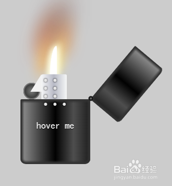
html+CSS3实现打火机开启关闭火焰效果
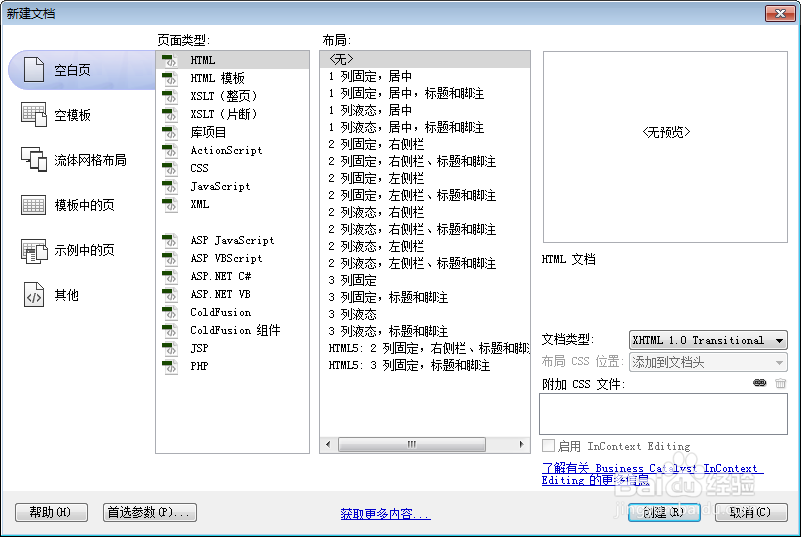
1、新建html文档。
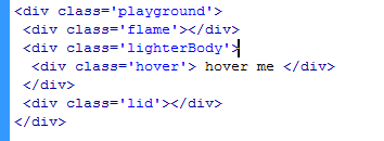
2、书写hmtl代码。
<div class='playground'>
<div class='flame'></div>
<div class='lighterBody'>
<div class='hover'> hover me </div>
</div>
<div class='lid'></div>
</div>
3、初始化css代码。
<style>
* { margin: 0; padding: 0 }
body { background: #cccccc; }
:before, :after { position: absolute; content: ""; }
</style>

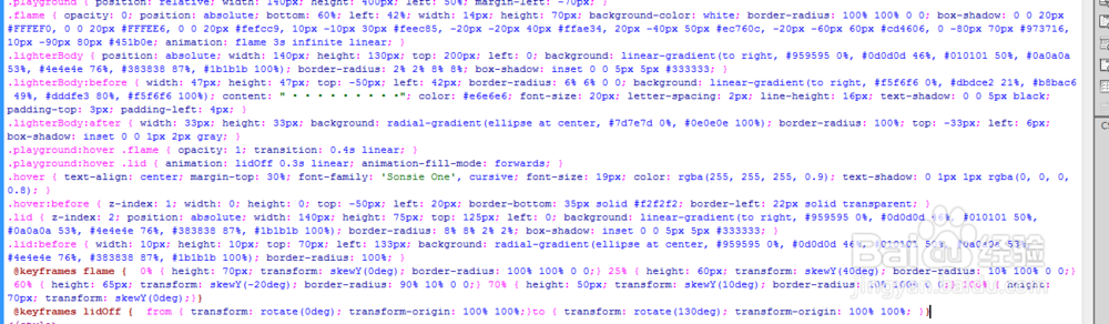
4、书写css代码。
.playground { position: relative; width: 140px; height: 400px; left: 50%; margin-left: -70px; }
.flame { opacity: 0; position: absolute; bottom: 60%; left: 42%; width: 14px; height: 70px; background-color: white; border-radius: 100% 100% 0 0; box-shadow: 0 0 20px #FFFEF0, 0 0 20px #FFFEE6, 0 0 20px #fefcc9, 10px -10px 30px #feec85, -20px -20px 40px #ffae34, 20px -40px 50px #ec760c, -20px -60px 60px #cd4606, 0 -80px 70px #973716, 10px -90px 80px #451b0e; animation: flame 3s infinite linear; }
.lighterBody { position: absolute; width: 140px; height: 130px; top: 200px; left: 0; background: linear-gradient(to right, #959595 0%, #0d0d0d 46%, #010101 50%, #0a0a0a 53%, #4e4e4e 76%, #383838 87%, #1b1b1b 100%); border-radius: 2% 2% 8% 8%; box-shadow: inset 0 0 5px 5px #333333; }
.lighterBody:before { width: 47px; height: 47px; top: -50px; left: 42px; border-radius: 6% 6% 0 0; background: linear-gradient(to right, #f5f6f6 0%, #dbdce2 21%, #b8bac6 49%, #dddfe3 80%, #f5f6f6 100%); content: " • • • • • • • • •"; color: #e6e6e6; font-size: 20px; letter-spacing: 2px; line-height: 16px; text-shadow: 0 0 5px black; padding-top: 3px; padding-left: 4px; }
.lighterBody:after { width: 33px; height: 33px; background: radial-gradient(ellipse at center, #7d7e7d 0%, #0e0e0e 100%); border-radius: 100%; top: -33px; left: 6px; box-shadow: inset 0 0 1px 2px gray; }
.playground:hover .flame { opacity: 1; transition: 0.4s linear; }
.playground:hover .lid { animation: lidOff 0.3s linear; animation-fill-mode: forwards; }
.hover { text-align: center; margin-top: 30%; font-family: 'Sonsie One', cursive; font-size: 19px; color: rgba(255, 255, 255, 0.9); text-shadow: 0 1px 1px rgba(0, 0, 0, 0.8); }
.hover:before { z-index: 1; width: 0; height: 0; top: -50px; left: 20px; border-bottom: 35px solid #f2f2f2; border-left: 22px solid transparent; }
.lid { z-index: 2; position: absolute; width: 140px; height: 75px; top: 125px; left: 0; background: linear-gradient(to right, #959595 0%, #0d0d0d 46%, #010101 50%, #0a0a0a 53%, #4e4e4e 76%, #383838 87%, #1b1b1b 100%); border-radius: 8% 8% 2% 2%; box-shadow: inset 0 0 5px 5px #333333; }
.lid:before { width: 10px; height: 10px; top: 70px; left: 133px; background: radial-gradient(ellipse at center, #959595 0%, #0d0d0d 46%, #010101 50%, #0a0a0a 53%, #4e4e4e 76%, #383838 87%, #1b1b1b 100%); border-radius: 100%; }
@keyframes flame { 0% {
height: 70px;
transform: skewY(0deg);
border-radius: 100% 100% 0 0;
}
25% {
height: 60px;
transform: skewY(40deg);
border-radius: 10% 100% 0 0;
}
60% {
height: 65px;
transform: skewY(-20deg);
border-radius: 90% 10% 0 0;
}
70% {
height: 50px;
transform: skewY(10deg);
border-radius: 10% 100% 0 0;
}
100% {
height: 70px;
transform: skewY(0deg);
}
}
@keyframes lidOff { from {
transform: rotate(0deg);
transform-origin: 100% 100%;
}
to { transform: rotate(130deg); transform-origin: 100% 100%; }
}
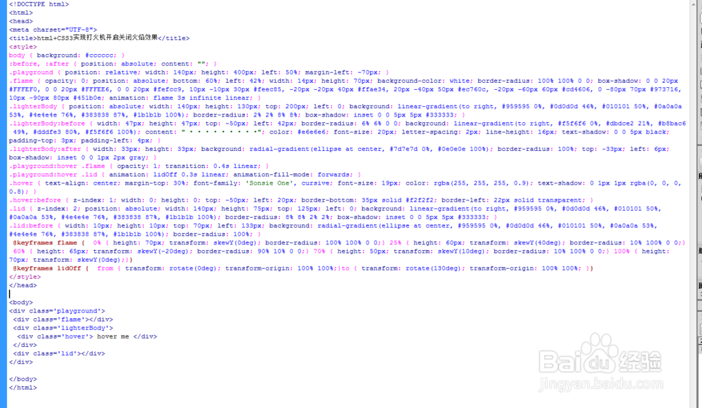
5、代码整体结构。
6、查看效果。