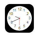
html+CSS3实现iOS7扁平化clock图标
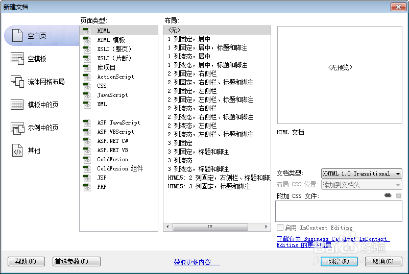
1、新建html文档。
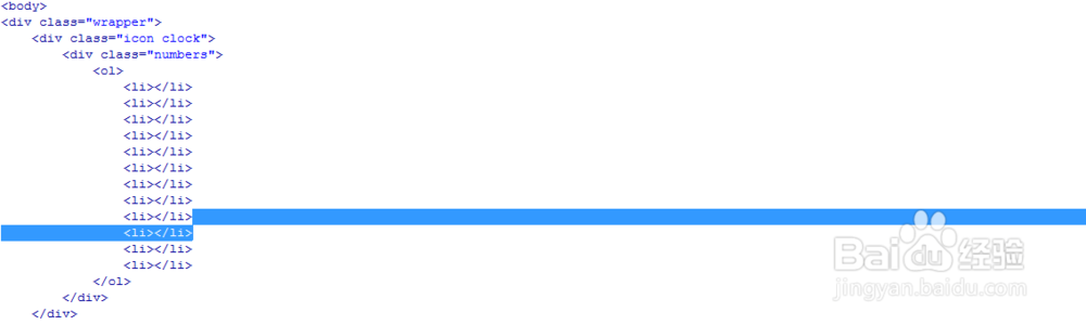
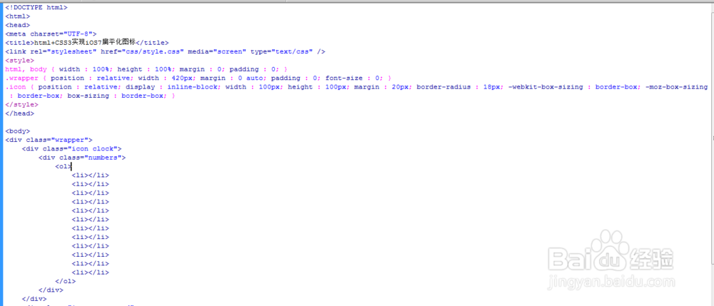
2、书写hmtl代码。
<div class="wrapper">
<div class="icon clock">
<div class="numbers">
<ol>
<li></li>
<li></li>
<li></li>
<li></li>
<li></li>
<li></li>
<li></li>
<li></li>
<li></li>
<li></li>
<li></li>
<li></li>
</ol>
</div>
</div>
</div>
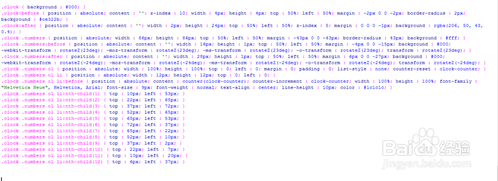
3、初始化css代码。
<style>
html, body { width : 100%; height : 100%; margin : 0; padding : 0; }
.wrapper { position : relative; width : 420px; margin : 0 auto; padding : 0; font-size : 0; }
.icon { position : relative; display : inline-block; width : 100px; height : 100px; margin : 20px; border-radius : 18px; -webkit-box-sizing : border-box; -moz-box-sizing : border-box; box-sizing : border-box; }
</style>

4、书写css代码。
.clock { background : #000; }
.clock:before { position : absolute; content : ''; z-index : 10; width : 4px; height : 4px; top : 50%; left : 50%; margin : -2px 0 0 -2px; border-radius : 2px; background : #ce322b; }
.clock:after { position : absolute; content : ''; width : 2px; height : 24px; top : 50%; left : 50%; z-index : 5; margin : 0 0 0 -1px; background : rgba(206, 50, 43, 0.4); }
.clock .numbers { position : absolute; width : 86px; height : 86px; top : 50%; left : 50%; margin : -43px 0 0 -43px; border-radius : 43px; background : #fff; }
.clock .numbers:before { position : absolute; content : ''; width : 16px; height : 1px; top : 50%; left : 50%; margin : -4px 0 0 -15px; background : #000; -webkit-transform : rotateZ(23deg); -moz-transform : rotateZ(23deg); -ms-transform : rotateZ(23deg); -o-transform : rotateZ(23deg); transform : rotateZ(23deg); }
.clock .numbers:after { position : absolute; content : ''; width : 28px; height : 1px; top : 50%; left : 50%; margin : 6px 0 0 -27px; background : #000; -webkit-transform : rotateZ(-24deg); -moz-transform : rotateZ(-24deg); -ms-transform : rotateZ(-24deg); -o-transform : rotateZ(-24deg); transform : rotateZ(-24deg); }
.clock .numbers ol { position : absolute; width : 100%; height : 100%; top : 0; left : 0; margin : 0; padding : 0; list-style : none; counter-reset : clock-counter; }
.clock .numbers ol li { position : absolute; width : 12px; height : 12px; top : 0; left : 0; }
.clock .numbers ol li:before { position : absolute; content : counter(clock-counter); counter-increment : clock-counter; width : 100%; height : 100%; font-family : "Helvetica Neue", Helvetica, Arial; font-size : 9px; font-weight : normal; text-align : center; line-height : 10px; color : #1c1c1c; }
.clock .numbers ol li:nth-child(1) { top : 10px; left : 53px; }
.clock .numbers ol li:nth-child(2) { top : 22px; left : 65px; }
.clock .numbers ol li:nth-child(3) { top : 37px; left : 72px; }
.clock .numbers ol li:nth-child(4) { top : 52px; left : 65px; }
.clock .numbers ol li:nth-child(5) { top : 65px; left : 53px; }
.clock .numbers ol li:nth-child(6) { top : 72px; left : 37px; }
.clock .numbers ol li:nth-child(7) { top : 65px; left : 22px; }
.clock .numbers ol li:nth-child(8) { top : 52px; left : 10px; }
.clock .numbers ol li:nth-child(9) { top : 37px; left : 2px; }
.clock .numbers ol li:nth-child(10) { top : 22px; left : 7px; }
.clock .numbers ol li:nth-child(11) { top : 10px; left : 20px; }
.clock .numbers ol li:nth-child(12) { top : 6px; left : 37px; }
5、代码整体结构
6、查看效果